## api
This page documents LegendList APIs for both React Native and React (Web).
Props apply to both React Native and Web unless otherwise noted. Platform-specific notes are called out inline.
## Imports and entrypoints
```ts
// Choose one platform-specific LegendList import
import { LegendList } from "@legendapp/list/react-native";
import { LegendList } from "@legendapp/list/react";
// Optional entrypoints
import { SectionList } from "@legendapp/list/section-list";
import { AnimatedLegendList } from "@legendapp/list/animated";
import { AnimatedLegendList as ReanimatedLegendList } from "@legendapp/list/reanimated";
import {
KeyboardAwareLegendList,
useKeyboardChatComposerInset,
useKeyboardScrollToEnd,
} from "@legendapp/list/keyboard";
import { KeyboardAvoidingLegendList } from "@legendapp/list/keyboard-legacy";
```
See [Keyboard & Animated](../react-native/keyboard-and-animated) for Reanimated-only props such as `sharedValues` and `itemLayoutAnimation`.
## Required Props
___
LegendList supports two render modes:
- Data mode: `data` + `renderItem`
- Children mode: `children`
When using one mode, the other mode's props should not be provided.
### children
```ts
children: ReactNode;
```
Render list items directly as children in children mode (instead of `data`/`renderItem`).
### data
```ts
data: ItemT[];
```
An array of the items to render in data mode. This can also be an array of keys if you want to get the item by key in [renderItem](#renderitem).
### renderItem
```ts
renderItem: (props: { item: ItemT; index: number; extraData: any; type?: string; data: readonly ItemT[] }) => ReactNode;
```
Takes an item from data and renders it into the list in data mode. The `type` parameter is available when using `getItemType`.
`renderItem` is called as a render callback. If your row uses hooks, return a component from the callback rather than passing the component function directly:
```tsx
const Row = ({ item }: { item: ItemT }) => {
const value = useRowValue(item.id);
return {value};
};
}
/>
```
See [React Native Docs](https://reactnative.dev/docs/flatlist#renderItem).
## Recommended Props
___
### keyExtractor
```ts
keyExtractor?: (item: ItemT, index: number) => string;
```
Strongly recommended. The `keyExtractor` prop lets Legend List save item layouts by key, so when the `data` array changes it can reuse previous layout information and update only the changed items.
Return a stable unique key for each logical item. Reusing a key for different items, or using the item index in a list that can reorder or prepend items, will attach cached measurements and recycled state to the wrong row. Index keys are only reasonable for static or append-only lists where earlier item positions never change. See [Use key extractor](../performance#use-keyextractor).
If LegendList detects duplicate keys, it will log a warning.
### recycleItems (React Native)
```ts
recycleItems?: boolean; // default: false
```
This will reuse the component rendered by your `renderItem` function. This can be a big performance improvement, but if your list items have internal state there is potential for state to carry over when a component is recycled for a different item. See [Performance](../performance#recycling-list-items).
This is mostly useful for React Native to reuse native views - it has a neglibible effect on web.
## Optional Props
___
### alignItemsAtEnd
```ts
alignItemsAtEnd?: boolean; // default: false
```
Aligns to the end of the screen. If there's only a few items, Legend List will add padding to the top to align them to the bottom. See [Chat interfaces](../guides#chat-interfaces) for more.
### alwaysRender
```ts
alwaysRender?: { top?: number; bottom?: number; indices?: number[]; keys?: string[] };
```
Keeps selected items mounted even when they scroll out of view. Use this for pinned items or sentinels. `keys` requires a stable `keyExtractor`.
### anchoredEndSpace
```ts
anchoredEndSpace?: {
anchorIndex: number;
anchorOffset?: number;
anchorMaxSize?: number;
onReady?: (info: {
anchorIndex: number | undefined;
anchorKey: string | undefined;
size: number;
}) => void;
onSizeChanged?: (size: number) => void;
};
```
Keeps a chosen item visually anchored to the start by adding trailing space when the content below that item underflows.
- `anchorIndex`: required index of the item to keep anchored.
- `anchorOffset`: subtracts pixels from the computed blank space. Useful when the anchored row should stop short of the edge.
- `anchorMaxSize`: caps the amount of inserted blank space.
- `onReady`: called when LegendList has authoritative anchored-tail sizing for the current anchor. Use this when an integration needs to wait until the inserted tail space is known before running follow-up scroll work.
- `onSizeChanged`: called whenever the inserted blank space changes.
Platform notes:
- Web: available on `LegendList` from `@legendapp/list/react`.
- React Native: use `KeyboardAwareLegendList` from `@legendapp/list/keyboard` for this lower-level integration.
### columnWrapperStyle
```ts
columnWrapperStyle?: StyleProp;
```
Style applied to each column's wrapper view.
### contentContainerClassName
```ts
contentContainerClassName?: string;
```
Web only. Adds a `className` to the inner content div inside the scroll container.
Use this when your app styles the content container with CSS classes instead of inline styles.
`gap-*`, `gap-x-*`, and `gap-y-*` classes in `contentContainerClassName` are not used for LegendList item spacing because items are positioned virtually. Use `contentContainerStyle={{ gap: 16, padding: 16 }}` or `columnWrapperStyle` instead.
### contentContainerStyle
```ts
contentContainerStyle?: StyleProp;
```
Style applied to the underlying ScrollView's content container.
On web, this maps to the inner content div’s CSS styles.
### contentInset
```ts
contentInset?: { top: number; left: number; bottom: number; right: number };
```
React Native only. Sets ScrollView content insets. On web, prefer padding via `contentContainerStyle` or `style`.
### contentInsetEndAdjustment
```ts
contentInsetEndAdjustment?: number;
```
Web only on `LegendList` from `@legendapp/list/react`. Adjusts the effective end inset without replacing the base `contentInset`.
LegendList also renders the adjustment as real trailing DOM space, so browser scroll range, `scrollToEnd`, and end-pinned behavior stay aligned when a floating composer or overlay grows and shrinks.
For React Native keyboard-aware lists, pass a Reanimated shared value to `KeyboardAwareLegendList` instead:
```tsx
const { contentInsetEndAdjustment, onComposerLayout } =
useKeyboardChatComposerInset(listRef, composerRef);
```
Use this for floating composers, input bars, or other UI that visually covers the end of the list while remaining outside normal list content flow.
### dataVersion
```ts
dataVersion?: Key;
```
Version token that forces the list to treat data as updated even when the array reference is stable. Increment this when mutating `data` in place.
### drawDistance
```ts
drawDistance?: number;
```
The `drawDistance` (defaults to `250`) is the buffer size in pixels above and below the viewport that will be rendered in advance. See [Performance](../performance#set-drawdistance-prop) for more.
### estimatedHeaderSize
```ts
estimatedHeaderSize?: number;
```
Estimated height of `ListHeaderComponent` before it is measured.
Use this when the expected header height is known before layout and the header appears above the first visible items. It lets LegendList allocate only the rows that are actually visible below the header on the initial frame, instead of rendering a full viewport of rows that may be hidden behind the header.
The measured header size replaces this estimate after layout.
### estimatedItemSize
```ts
estimatedItemSize?: number;
```
Optional first-render allocation hint. Legend List works well without this prop, and after rows are measured it uses measured item sizes and averages instead.
In v3, `estimatedItemSize` mostly affects how many item containers are allocated before measurement. The default estimate is `100px`, so you usually do not need to set it unless your rows are significantly larger or smaller than that, or you need better initial offsets for a far `initialScrollIndex` / `snapToIndices` target.
### estimatedListSize
```ts
estimatedListSize?: { height: number; width: number };
```
Estimated size of the list viewport used as a first-render hint before actual layout is measured.
### extraData
```ts
extraData?: any;
```
Avoid this when possible. `extraData` is a whole-list invalidation escape hatch, not the recommended way to pass changing item state.
Changing `extraData` causes Legend List to re-render all items because the value is passed through every `renderItem` call. That can be expensive for large lists or frequently changing state.
Prefer external state that each item subscribes to directly, for example React context, a state library selector, or another item-scoped subscription. Use `extraData` only when you intentionally need every rendered item to re-evaluate from the same changed value.
See [React Native Docs](https://reactnative.dev/docs/flatlist#extraData).
### experimental_adaptiveRender
```ts
type AdaptiveRender = "normal" | "light";
experimental_adaptiveRender?: {
initialMode?: AdaptiveRender; // default: "normal"
enterVelocity?: number; // default: 3 native, 6 web
exitVelocity?: number; // default: 1 native, 3 web
exitDelay?: number; // default: 250
onChange?: (mode: AdaptiveRender) => void;
};
```
Enables an adaptive render signal for expensive item content. This is a performance optimization for lists whose rows do significant work while rendering, such as charts, media, syntax highlighting, rich previews, embeds, or expensive formatting.
When scroll velocity crosses `enterVelocity`, LegendList switches the signal to `"light"` so rows can render a cheaper version while the list is moving quickly. After velocity drops below `exitVelocity` for `exitDelay` milliseconds, it returns to `"normal"`. This reduces JS/render work during fast scrolls and lets full content come back when the user slows down or stops.
Use `initialMode` when rows should start in `"light"` mode before the list is ready, for example when you prefer a very cheap first pass before expensive media or charts render.
Good uses for light mode include:
- Rendering unformatted text instead of expensive formatted text, markdown, or syntax highlighting.
- Rendering skeleton boxes instead of images, videos, charts, or rich previews.
- Skipping gesture detectors, menus, modal setup, or other interactive wrappers that are only needed when the row is stable in view.
There are two main ways to use adaptive rendering:
1. Inside rendered items, read the current mode with [useAdaptiveRender](#useadaptiverender) or subscribe to changes with [useAdaptiveRenderChange](#useadaptiverenderchange). This is the simplest option when each row can choose its own light/full render.
2. Use `experimental_adaptiveRender.onChange` to write the mode into global or external state, then let expensive child components subscribe to that state. This is useful when adaptive mode needs to affect components deeper in the row tree or components that are shared outside the direct list item boundary.
```tsx
}
experimental_adaptiveRender={{
enterVelocity: 6,
exitVelocity: 3,
onChange: (mode) => adaptiveRenderStore.set(mode),
}}
/>
```
Use adaptive rendering for the expensive part of a row, not as a replacement for basic row memoization or stable `renderItem` patterns. Simple text rows usually do not need it.
The light version should keep the same rendered size as the normal version. If switching modes changes an item's height or width, the list has to correct measured positions while scrolling, which can cause visible layout shifts.
### getFixedItemSize
```ts
getFixedItemSize?: (item: ItemT, index: number, itemType?: string) => number | undefined;
```
For items with known fixed sizes, this enables optimal performance as it disables the overhead of measuring and updating item size. Return a number for fixed-size items or undefined for dynamic-size items.
### getItemType
```ts
getItemType?: (item: ItemT, index: number) => string;
```
Allows categorizing different item types for better performance optimization. Items with the same type can be recycled more efficiently.
### horizontal
```ts
horizontal?: boolean; // default: false
```
Renders items along the horizontal axis instead of the vertical axis.
### initialScrollAtEnd
```ts
initialScrollAtEnd?: boolean; // default: false
```
When true, the list initializes scrolled to the last item. Overrides `initialScrollIndex` and `initialScrollOffset` when data is available.
This is designed for chat/feed screens and works with dynamic item measurement, async data arrival, and end-inset changes from floating composers. On iOS, LegendList waits for native initial-scroll confirmation before marking the initial scroll complete.
### initialScrollIndex
```ts
initialScrollIndex?: number | { index: number; viewOffset?: number; viewPosition?: number };
```
Start scrolled with this item at the top (or at the provided `viewPosition`). If item sizes are dynamic, the list will adjust after measurement using the default scroll‑stabilization behavior.
For large lists, LegendList can seed the initial render near the target index instead of scanning from the beginning when it has enough sizing information. If data arrives after mount, the initial target is re-armed and applied when items are available.
### initialScrollOffset
```ts
initialScrollOffset?: number;
```
Start scrolled to this offset.
### itemsAreEqual
```ts
itemsAreEqual?: (itemPrevious: ItemT, item: ItemT, index: number, data: readonly ItemT[]) => boolean;
```
Optional equality comparator used during data changes to preserve known item sizes and reduce relayout work when items are logically unchanged.
### ItemSeparatorComponent
```ts
ItemSeparatorComponent?: React.ComponentType<{ leadingItem: ItemT }>
```
Rendered in between each item, but not at the top or bottom.
See [React Native Docs](https://reactnative.dev/docs/flatlist#itemseparatorcomponent).
### ListEmptyComponent
```ts
ListEmptyComponent?: React.ComponentType | React.ReactElement | null | undefined;
```
Rendered when the list is empty.
See [React Native Docs](https://reactnative.dev/docs/flatlist#listemptycomponent).
### ListFooterComponent
```ts
ListFooterComponent?: React.ComponentType | React.ReactElement | null | undefined;
```
Rendered at the bottom of all the items.
See [React Native Docs](https://reactnative.dev/docs/flatlist#listfootercomponent).
### ListFooterComponentStyle
```ts
ListFooterComponentStyle?: StyleProp | undefined;
```
Styling for internal View for `ListFooterComponent`.
See [React Native Docs](https://reactnative.dev/docs/flatlist#listfootercomponentstyle).
### ListHeaderComponent
```ts
ListHeaderComponent?: React.ComponentType | React.ReactElement | null | undefined;
```
Rendered at the top of all the items.
See [React Native Docs](https://reactnative.dev/docs/flatlist#listheadercomponent).
### ListHeaderComponentStyle
```ts
ListHeaderComponentStyle?: StyleProp | undefined;
```
Styling for internal View for `ListHeaderComponent`.
See [React Native Docs](https://reactnative.dev/docs/flatlist#listheadercomponentstyle).
### maintainScrollAtEnd
```ts
maintainScrollAtEnd?: boolean | {
animated?: boolean;
on?: {
dataChange?: boolean;
footerLayout?: boolean;
itemLayout?: boolean;
layout?: boolean;
};
};
```
If enabled, LegendList keeps the view pinned to end when you are near the bottom.
- `true`: enables end-maintenance for layout, item-layout, and data updates.
- `animated`: whether the automatic scroll-to-end should animate. Defaults to `false`.
- If `on` is omitted, the object form enables all triggers.
- If `on` is provided, only the keys set to `true` are enabled.
- `footerLayout`: opt into footer size changes when using an explicit `on` config. This is useful for chat typing indicators and dynamic footers that should keep an end-pinned list at the bottom.
See [Chat interfaces](../guides#chat-interfaces) for more.
### maintainScrollAtEndThreshold
```ts
maintainScrollAtEndThreshold?: number;
```
This defines what percent of the screen counts as the bottom. Defaults to `0.1`.
See [Chat interfaces](../guides#chat-interfaces) for more.
### maintainVisibleContentPosition
```ts
maintainVisibleContentPosition?: boolean | {
data?: boolean;
size?: boolean;
shouldRestorePosition?: (item: ItemT, index: number, data: ItemT[]) => boolean;
};
```
Controls how the list stabilizes scroll position when items above the viewport change.
- `size` (default: true): stabilizes during size/layout changes while scrolling
- `data` (default: false): anchors when the data array changes
- `shouldRestorePosition`: return `false` to skip anchoring for specific items
Passing `true` enables both `size` and `data`. Passing `false` disables both.
React Native note: when `data` anchoring is enabled, LegendList uses ScrollView’s [maintainVisibleContentPosition](https://reactnative.dev/docs/scrollview#maintainvisiblecontentposition) under the hood. Android requires React Native 0.72+ for that prop.
### numColumns
```ts
numColumns?: number;
```
Multiple columns will zig-zag like a flexWrap layout. Rows will take the maximum height of their columns, so items should all be the same height - masonry layouts are not supported.
### onEndReached
```ts
onEndReached?: ((info: { distanceFromEnd: number }) => void) | null | undefined;
```
A callback that's called only once when scroll is within `onEndReachedThreshold` of the bottom of the list. It resets when scroll goes above the threshold and then will be called again when scrolling back into the threshold.
### onEndReachedThreshold
```ts
onEndReachedThreshold?: number | null | undefined;
```
The distance from the end as a percentage that the scroll should be from the end to trigger `onEndReached`. It is multiplied by screen size, so a value of 0.5 will trigger `onEndReached` when scrolling to half a screen from the end.
### onFirstVisibleItemChanged
```ts
onFirstVisibleItemChanged?: (info: {
index: number;
item: ItemT;
key: string;
}) => void;
```
Called when the first visible item changes. This is emitted from LegendList's core range calculation and is cheaper than full viewability tracking when you only need to follow the item at the top of the viewport, such as updating a section label, mini-map, or current date marker.
### onItemSizeChanged
```ts
onItemSizeChanged?: (info: {
size: number;
previous: number;
index: number;
itemKey: string;
itemData: ItemT;
}) => void;
```
Called whenever an item's rendered size changes. This can be used to inspect real row sizes, especially if you are deciding whether `estimatedItemSize` is worth setting for unusual item sizes.
### onLoad
```ts
onLoad?: (info: { elapsedTimeInMs: number }) => void;
```
Called after the list is ready to render. Useful for measuring first render readiness.
### onMetricsChange
```ts
onMetricsChange?: (metrics: { headerSize: number; footerSize: number }) => void;
```
Called when list layout metrics change (header or footer size updates).
### onRefresh
```ts
onRefresh?: () => void;
```
React Native only. Called whenever a user pulls down to refresh. See [React Native Docs](https://reactnative.dev/docs/flatlist#onRefresh).
### onScroll
```ts
onScroll?: (event: NativeSyntheticEvent) => void;
```
Called on scroll events with platform-specific scroll data.
### onStartReached
```ts
onStartReached?: ((info: { distanceFromStart: number }) => void) | null | undefined;
```
A callback that's called only once when scroll is within `onStartReachedThreshold` of the top of the list. It resets when scroll goes above the threshold and then will be called again when scrolling back into the threshold.
### onStartReachedThreshold
```ts
onStartReachedThreshold?: number | null | undefined;
```
The distance from the start as a percentage that the scroll should be from the start to trigger `onStartReached`. It is multiplied by screen size, so a value of 0.5 will trigger `onStartReached` when scrolling to half a screen from the start.
### onStickyHeaderChange
```ts
onStickyHeaderChange?: (info: { index: number; item: any }) => void;
```
Called when the active sticky header changes.
### onViewableItemsChanged
```ts
onViewableItemsChanged?: OnViewableItemsChanged | undefined;
```
Called when the viewability of rows changes, as defined by the `viewabilityConfig` prop.
See [React Native Docs](https://reactnative.dev/docs/flatlist#onviewableitemschanged).
### overrideItemLayout
```ts
overrideItemLayout?: (
layout: { span?: number },
item: ItemT,
index: number,
maxColumns: number,
extraData?: any
) => void;
```
Customize multi-column item layout (for example, setting `span`) before positions are computed.
### progressViewOffset
```ts
progressViewOffset?: number | undefined;
```
React Native only. Offset in pixels for the refresh indicator.
### ref
```ts
ref?: LegendListRef;
```
Used to call `scrollTo` [methods](#ref-methods).
### refreshing
```ts
refreshing?: boolean;
```
React Native only. Set this true while waiting for new data from a refresh.
See [React Native Docs](https://reactnative.dev/docs/flatlist#refreshing).
### refScrollView
```ts
refScrollView?: React.Ref;
```
Ref to the underlying scroll container instance.
### renderScrollComponent
```ts
renderScrollComponent?: (props: ScrollViewProps) => ReactElement | null
```
Render a custom scroll component. On React Native this is typically a `ScrollView`; on web this is the underlying DOM scroll element wrapper.
On React Native, when using `stickyHeaderIndices`, provide an Animated-capable scroll component.
Note that passing `renderScrollComponent` as an inline function might cause you to lose scroll position if the list is rerendered.
```tsx
renderScrollComponent={(props) => }
```
Instead, it's better to extract it as a custom component.
```tsx
const CustomScrollView = (props: ScrollViewProps) => {
return ;
};
```
### rtl
```ts
rtl?: boolean;
```
Forces right-to-left layout behavior for this list instance. When omitted, LegendList uses the platform/global RTL setting, such as React Native's `I18nManager.isRTL`.
This is mainly useful for horizontal lists when you need one list to override the app-level RTL direction.
### snapToIndices
```ts
snapToIndices?: number[];
```
An array of item indices that become snap points. LegendList converts those indices into scroll offsets and passes them to the underlying scroll container as snap offsets.
On web, snap targets can point to items outside the currently mounted DOM window. LegendList computes the offsets from list measurements and estimates, so sparse snap targets can still work with virtualization.
Use `getFixedItemSize` when snap targets have exact fixed sizes. For dynamic rows, `estimatedItemSize` is only an initial offset hint until rows are measured; it is usually worth setting only when rows differ significantly from the default `100px`.
### stickyHeaderConfig
```ts
stickyHeaderConfig?: {
offset?: number;
backdropComponent?: React.ComponentType | React.ReactElement | null | undefined;
};
```
Configures sticky header behavior:
- `offset`: sticky top offset (for fixed toolbars/navbars)
- `backdropComponent`: optional backdrop rendered behind sticky header
### stickyHeaderIndices
```ts
stickyHeaderIndices?: number[];
```
An array of indices for items that should stick to the top of the list while scrolling. Sticky headers remain visible at the top of the viewport as you scroll past them.
Not supported with `horizontal={true}`.
### style
```ts
style?: StyleProp;
```
Style applied to the underlying ScrollView. On web this maps to the scroll container’s CSS style.
### useWindowScroll
```ts
useWindowScroll?: boolean; // default: false
```
Web only. When true, LegendList listens to window/body scrolling instead of rendering its own scrollable container.
### viewabilityConfig
```ts
viewabilityConfig?: ViewabilityConfig;
```
Configuration for when to update the `onViewableItemsChanged` callback.
See [React Native Docs](https://reactnative.dev/docs/flatlist#viewabilityconfig).
### viewabilityConfigCallbackPairs
```ts
viewabilityConfigCallbackPairs?: ViewabilityConfigCallbackPairs | undefined;
```
List of `ViewabilityConfig`/`onViewableItemsChanged` pairs. A specific `onViewableItemsChanged` will be called when its corresponding `ViewabilityConfig`'s conditions are met.
See [React Native Docs](https://reactnative.dev/docs/flatlist#viewabilityconfigcallbackpairs).
## SectionList
Legend List ships a SectionList-compatible component built on the same virtualization core.
```tsx
import { SectionList } from "@legendapp/list/section-list";
```
### Quick example
```tsx
import { Text } from "react-native";
import { SectionList } from "@legendapp/list/section-list";
const sections = [
{ title: "A", data: ["Apple", "Avocado"] },
{ title: "B", data: ["Banana", "Blueberry"] },
];
const Header = ({ title }: { title: string }) => {title};
const Row = ({ label }: { label: string }) => {label};
export function MySectionList() {
return (
item}
renderSectionHeader={({ section }) => }
renderItem={({ item }) => }
stickySectionHeadersEnabled
estimatedItemSize={48}
/>
);
}
```
### Behavior and API
- Mirrors React Native `SectionList` props: `sections`, `renderSectionHeader`, `renderSectionFooter`, separators, `stickySectionHeadersEnabled`, and `scrollToLocation`.
- Accepts shared LegendList performance props like `recycleItems`, `maintainScrollAtEnd`, `drawDistance`, and `experimental_adaptiveRender`.
- Manages `stickyHeaderIndices` internally.
Common SectionList-specific props:
```ts
type SectionListProps = {
ItemSeparatorComponent?: ComponentType> | null;
SectionSeparatorComponent?: ComponentType> | ReactElement | null;
getFixedItemSize?: (info:
| (SectionListRenderItemInfo & { type: "item" })
| { section: SectionListData; type: "header" }
| { section: SectionListData; type: "footer" }
| (SectionListSeparatorProps & { type: "item-separator" })
| (SectionListSeparatorProps & { type: "section-separator" })
) => number | undefined;
keyExtractor?: (item: ItemT, index: number) => string;
onViewableItemsChanged?: SectionListOnViewableItemsChanged;
renderItem?: (info: SectionListRenderItemInfo) => ReactElement | null;
renderSectionFooter?: (info: { section: SectionListData }) => ReactElement | null;
renderSectionHeader?: (info: { section: SectionListData }) => ReactElement | null;
sections: ReadonlyArray>;
stickySectionHeadersEnabled?: boolean;
};
```
Notes:
- `stickySectionHeadersEnabled` defaults to the React Native platform behavior. It is enabled by default on iOS and disabled by default on other platforms.
- `getFixedItemSize` can return exact sizes for section items, headers, footers, item separators, and section separators. Return `undefined` for row types that should stay dynamically measured.
- `onViewableItemsChanged` receives item tokens mapped back to `{ item, index, key, isViewable, section }`, so callbacks do not need to understand the internal flattened section rows.
- Section and item separators receive React Native-style separator helpers (`highlight`, `unhighlight`, `updateProps`) plus section/item context.
### scrollToLocation
```ts
ref.current?.scrollToLocation({
sectionIndex: 2,
itemIndex: 10,
viewPosition: 0,
viewOffset: 12,
animated: true,
});
```
### Limitations
- `horizontal` disables sticky section headers.
- `numColumns` and `columnWrapperStyle` are not supported (SectionList is always one column).
- `stickyHeaderIndices` is managed internally.
## Ref Methods
___
### clearCaches
```ts
clearCaches(options?: { mode?: "sizes" | "full" }): void;
```
Clears internal virtualization caches.
- `sizes` (default): clears size/average caches and recalculates item positions.
- `full`: also clears key/index/position caches.
Useful if you know cached measurements are stale after major data/layout changes.
### flashScrollIndicators
```ts
flashScrollIndicators(): void;
```
Asks the underlying scroll component to briefly show its scroll indicators.
### getNativeScrollRef
```ts
getNativeScrollRef(): any;
```
Returns the underlying scroll instance (platform-specific type).
### getScrollableNode
```ts
getScrollableNode(): any;
```
Returns the underlying native/DOM node used for scrolling.
### getScrollResponder
```ts
getScrollResponder(): any;
```
Returns the platform scroll responder object for advanced integrations.
### getState
```ts
getState(): LegendListState;
```
Returns a live snapshot API for advanced integrations. See [getState()](#getstate-details) for the full type, fields, listener channels, caveats, and examples.
### reportContentInset
```ts
reportContentInset(inset?: { top?: number; left?: number; bottom?: number; right?: number } | null): void;
```
Reports an externally measured content inset (merged with props/native insets). Pass `null`/`undefined` to clear.
### scrollIndexIntoView
Scrolls the index into view. If the index is above the viewable range it will be scrolled to the top of the screen, and if it's below the viewable range it will be scrolled to the bottom of the screen.
```ts
scrollIndexIntoView(params: {
animated?: boolean | undefined;
index: number;
}): Promise
```
```jsx
import { useRef } from "react";
import { Button } from "react-native";
import { LegendList } from "@legendapp/list/react-native";
export function ScrollExample() {
const listRef = useRef(null);
const scrollToItem = () => {
// Scroll to the item at index 10
listRef.current?.scrollIndexIntoView({ index: 10 });
};
return (
<>
);
}
```
### scrollItemIntoView
Scrolls the item into view. If the item is above the viewable range it will be scrolled to the top of the screen, and if it's below the viewable range it will be scrolled to the bottom of the screen.
```ts
scrollItemIntoView(params: {
animated?: boolean | undefined;
item: any;
}): Promise;
```
```jsx
import { useRef } from "react";
import { Button } from "react-native";
import { LegendList } from "@legendapp/list/react-native";
export function ScrollToItemExample() {
const listRef = useRef(null);
const targetItem = { id: "item-5", text: "Target Item" };
const scrollToSpecificItem = () => {
// Scroll to the item that matches targetItem
listRef.current?.scrollItemIntoView({ item: targetItem });
};
return (
<>
);
}
```
### scrollToEnd
```ts
scrollToEnd(params?: {
animated?: boolean,
viewOffset?: number,
}): Promise;
```
Scrolls to the end of the list.
Valid parameters:
- *animated* (boolean) - Whether the list should do an animation while scrolling. Defaults to true.
### scrollToIndex
```ts
scrollToIndex(params: {
index: number;
animated?: boolean;
viewOffset?: number;
viewPosition?: number;
}): Promise;
```
Scrolls to the item at the specified index. For the most accurate initial offset, use [getFixedItemSize](#getfixeditemsize) for truly fixed-size rows. Dynamic rows stabilize through measurement; `estimatedItemSize` is only an initial hint and is most useful when rows differ significantly from the default `100px`.
Returns a promise that resolves when the imperative scroll finishes (or immediately if no scroll was needed).
### scrollToItem
```ts
scrollToItem(params: {
animated?: boolean,
item: Item,
viewOffset?: number;
viewPosition?: number;
}): Promise;
```
Requires linear scan through data - use [scrollToIndex](#scrolltoindex) instead if possible. Provided for compatibility with FlatList only.
Valid parameters:
- *animated* (boolean) - Whether the list should do an animation while scrolling. Defaults to true.
- *item* (object) - The item to scroll to. Required.
### scrollToOffset
```ts
scrollToOffset(params: {
offset: number;
animated?: boolean;
}): Promise;
```
Scroll to a specific content pixel offset in the list.
Valid parameters:
- *offset* (number) - The offset to scroll to. In case of horizontal being true, the offset is the x-value, in any other case the offset is the y-value. Required.
- *animated* (boolean) - Whether the list should do an animation while scrolling. Defaults to true.
### setItemSize
```ts
setItemSize(itemKey: string, size: { height: number; width: number }): void;
```
Updates a known item's measured size directly and recalculates positions as needed. Use this when an item's content changes outside normal layout measurement, for example when media dimensions arrive from cache or a custom native surface reports its final size through a separate channel.
`itemKey` is the value returned by `keyExtractor`, so stable keys are required.
### setScrollProcessingEnabled
```ts
setScrollProcessingEnabled(enabled: boolean): void;
```
Enables or disables scroll processing. Useful when you need to temporarily opt out of list virtualization behavior.
### setVisibleContentAnchorOffset
```ts
setVisibleContentAnchorOffset(value: number | ((current: number) => number)): void;
```
Adjusts the internal anchor offset used by `maintainVisibleContentPosition`. Useful for advanced scroll anchoring behavior.
## Hooks
Hooks are exported from both `@legendapp/list/react-native` and `@legendapp/list/react`.
### useAdaptiveRender
```ts
useAdaptiveRender: () => "normal" | "light";
```
Returns the current adaptive render mode for the item being rendered. Enable the signal with [experimental_adaptiveRender](#experimental_adaptiverender), then use this hook inside rows to switch expensive content to a lighter render while the list is moving quickly.
```tsx
import { useAdaptiveRender } from "@legendapp/list/react-native";
function FeedRow({ item }) {
const mode = useAdaptiveRender();
return (
{mode === "light" ? : }
);
}
```
### useAdaptiveRenderChange
```ts
useAdaptiveRenderChange: (callback: (mode: "normal" | "light") => void) => void;
```
Runs `callback` whenever the adaptive render mode changes for the current item. Use this when switching modes should drive item-local imperative work, such as pausing a chart, video, or expensive animation while fast scrolling is active.
### useIsLastItem
```ts
useIsLastItem: () => boolean;
```
Returns `true` when the current rendered item is one of the list's last items.
Useful for conditional spacing, CTA rows, or end-of-list UI logic.
### useListScrollSize
```ts
useListScrollSize: () => { width: number; height: number };
```
Returns the current scroll viewport size for the parent list.
Useful when item rendering depends on viewport dimensions.
### useRecyclingEffect
```ts
interface LegendListRecyclingState {
item: T;
prevItem: T | undefined;
index: number;
prevIndex: number | undefined;
}
useRecyclingEffect: (effect: (info: LegendListRecyclingState) => void | (() => void)) => void;
```
`useRecyclingEffect` can be used to reset any side effects when an item gets recycled.
```tsx
import { useRef } from "react";
import { useRecyclingEffect } from "@legendapp/list/react-native"
export function ItemComponent({ item }) {
const refSwipeable = useRef(null);
const refVideo = useRef(null);
// A callback when the item is recycled into a new item
useRecyclingEffect(({ item, prevItem, index, prevIndex }) => {
// Reset any side effects from the previous item
refSwipeable?.current?.close();
refVideo?.current?.reset();
});
// ...
}
```
### useRecyclingState
```ts
interface LegendListRecyclingState {
item: T;
prevItem: T | undefined;
index: number;
prevIndex: number | undefined;
}
useRecyclingState: (
updateState: ((info: LegendListRecyclingState) => T) | T
) => [T, Dispatch>];
```
`useRecyclingState` automatically resets the state when an item is recycled into a new item.
```tsx
import { useRecyclingState } from "@legendapp/list/react-native"
export function ItemComponent({ item }) {
// Like useState but it resets when the item is recycled
const [isExpanded, setIsExpanded] = useRecyclingState(() => false);
// ...
}
```
### useSyncLayout
```ts
useSyncLayout: () => () => void;
```
A hook for synchronizing layout operations. This is useful for advanced use cases where you need to coordinate layout updates with other components or operations.
```tsx
import { View, Text } from "react-native";
import { useSyncLayout } from "@legendapp/list/react-native"
export function ItemComponent({ item }) {
const syncLayout = useSyncLayout();
return (
{item.title}
);
}
```
### useViewability
```ts
interface ViewToken {
containerId: number;
index: number;
isViewable: boolean;
item: ItemT;
key: string;
}
useViewability: (callback: (viewToken: ViewToken) => void, configId?: string) => void;
```
A hook that provides callbacks when an item's viewability changes. This hook registers a callback that will be invoked whenever the item's visibility status changes, providing detailed information about the item through the ViewToken interface. It is similar to [onViewableItemsChanged](#onviewableitemschanged) but runs for only the rendering item. If you defined multiple viewability configs using [viewabilityConfigCallbackPairs](#viewabilityconfigcallbackpairs) then provide the id of the one you're interested in with `configId`.
```tsx
import { useState } from "react";
import { View, Text } from "react-native";
import { useViewability } from "@legendapp/list/react-native"
function ExpensiveComponent() {
return Expensive content;
}
function PlaceholderComponent() {
return Placeholder;
}
export function ItemComponent({ item }) {
const [isVisible, setIsVisible] = useState(false);
useViewability((viewToken) => {
// Called when viewability changes
setIsVisible(viewToken.isViewable);
if (viewToken.isViewable) {
console.log("Item visible:", viewToken.item);
console.log("Item index:", viewToken.index);
}
}, "main");
return (
{isVisible ? : }
);
}
```
### useViewabilityAmount
```ts
interface ViewAmountToken {
containerId: number;
index: number;
isViewable: boolean;
item: ItemT;
key: string;
percentOfScroller: number;
percentVisible: number;
scrollSize: number;
size: number;
sizeVisible: number;
}
useViewabilityAmount: (callback: (viewAmountToken: ViewAmountToken) => void) => void;
```
A hook that provides detailed metrics about how much of an item is visible in the viewport. The callback receives a ViewAmountToken with information like the pixel measurements (sizeVisible, size), percentage visible, and more.
```tsx
import { useState } from "react";
import { Animated, Text } from "react-native";
import { useViewabilityAmount } from "@legendapp/list/react-native"
export function ItemComponent({ item }) {
const [opacity, setOpacity] = useState(0);
useViewabilityAmount((viewAmountToken) => {
// Get detailed visibility information
setOpacity(viewAmountToken.percentVisible);
// Additional metrics available:
// viewAmountToken.sizeVisible - pixels of item visible in viewport
// viewAmountToken.size - total size of the item
// viewAmountToken.percentOfScroller - what percent of the scroller this item takes up
// viewAmountToken.scrollSize - size of the viewport
});
return (
{item.title}
);
}
```
## getState()
`getState()` is a function on `LegendListRef`, accessed as `ref.current?.getState()`. See its entry in [Ref Methods](#ref-method-getstate).
This is likely not necessary in most apps, but can power advanced functionality and customization. It is used by [KeyboardAwareLegendList](../react-native/keyboard-and-animated#keyboardawarelegendlist) for example.
### LegendListState type
```ts
type LegendListState = {
activeStickyIndex: number;
contentLength: number;
data: readonly any[];
elementAtIndex: (index: number) => any;
end: number;
endBuffered: number;
getAverageItemSizes: () => Record;
isAtEnd: boolean;
isAtStart: boolean;
isEndReached: boolean;
isNearEnd: boolean;
isNearStart: boolean;
isStartReached: boolean;
isWithinMaintainScrollAtEndThreshold: boolean;
listen: (
listenerType: T,
callback: (value: ListenerTypeValueMap[T]) => void
) => () => void;
listenToPosition: (key: string, callback: (value: number) => void) => () => void;
positionAtIndex: (index: number) => number;
positionByKey: (key: string) => number | undefined;
scroll: number;
scrollLength: number;
scrollVelocity: number;
sizeAtIndex: (index: number) => number;
sizes: Map;
start: number;
startBuffered: number;
};
type LegendListAverageItemSize = {
average: number;
count: number;
};
```
### Fields and Methods
- `activeStickyIndex`: currently active sticky item index (`-1` when none)
- `contentLength`: content size of the list including header/footer/insets
- `data`: current data array reference used by the list
- `elementAtIndex(index)`: rendered native element for an index (if currently mapped to a container)
- `getAverageItemSizes()`: measured average item sizes grouped by item type. Use this to inspect real sizing data when deciding whether `estimatedItemSize` is worth setting for unusually sized rows.
- `isAtStart` / `isAtEnd`: threshold-based booleans for edge-of-list state
- `isNearStart` / `isNearEnd`: proximity booleans based on the configured start/end thresholds
- `isStartReached` / `isEndReached`: whether the one-shot threshold callbacks are currently latched
- `isWithinMaintainScrollAtEndThreshold`: whether the current scroll position is close enough to the tail for `maintainScrollAtEnd` to apply
- `listen(...)`: subscribe to selected internal state channels
- `listenToPosition(key, ...)`: subscribe to position updates for one item key
- `positionAtIndex(index)`: known position for an index
- `positionByKey(key)`: known position for an item key (if available)
- `scroll`: current scroll offset
- `scrollLength`: viewport length along scroll axis
- `scrollVelocity`: current estimated scroll velocity
- `sizeAtIndex(index)`: known measured size for an index
- `sizes`: key-to-size map of known measured item sizes
- `start` / `end`: visible range bounds without buffer
- `startBuffered` / `endBuffered`: virtualized range bounds including draw buffer
### Listen Channels
`listen` supports these channel names:
- `activeStickyIndex` (`number`)
- `anchoredEndSpaceSize` (`number`)
- `footerSize` (`number`)
- `headerSize` (`number`)
- `isAtEnd` (`boolean`)
- `isAtStart` (`boolean`)
- `isNearEnd` (`boolean`)
- `isNearStart` (`boolean`)
- `isWithinMaintainScrollAtEndThreshold` (`boolean`)
- `lastItemKeys` (`string[]`)
- `lastPositionUpdate` (`number`)
- `numContainers` (`number`)
- `numContainersPooled` (`number`)
- `otherAxisSize` (`number`)
- `readyToRender` (`boolean`)
- `snapToOffsets` (`number[]`)
- `totalSize` (`number`)
### Caveats
- `positionAtIndex` and `sizeAtIndex` assume the item has been measured; for unmeasured items values may be unavailable.
- `positionByKey` can return `undefined` if a key is unknown or not measured yet.
- `elementAtIndex` can return `null`/`undefined` when the item is not currently rendered.
- `sizes` is a live `Map` reference that updates as list state changes.
- `getAverageItemSizes()` only reports types that have measured items. Items without a `getItemType` value are grouped under `default`.
### Examples
```tsx
import { useEffect, useRef } from "react";
import { LegendList, type LegendListRef } from "@legendapp/list/react-native";
function StateSnapshotExample() {
const ref = useRef(null);
useEffect(() => {
const state = ref.current?.getState();
if (!state) return;
console.log("scroll", state.scroll, "velocity", state.scrollVelocity);
console.log("visible range", state.start, state.end);
}, []);
return ;
}
```
```tsx
import { useEffect, useRef } from "react";
import { LegendList, type LegendListRef } from "@legendapp/list/react-native";
function ListenerExample() {
const ref = useRef(null);
useEffect(() => {
const state = ref.current?.getState();
if (!state) return;
const unsubscribeTotal = state.listen("totalSize", (total) => {
console.log("total size changed", total);
});
const unsubscribeSticky = state.listen("activeStickyIndex", (index) => {
console.log("active sticky index", index);
});
return () => {
unsubscribeTotal();
unsubscribeSticky();
};
}, []);
return ;
}
```
```tsx
import { useEffect, useRef } from "react";
import { LegendList, type LegendListRef } from "@legendapp/list/react-native";
function PositionListenerExample() {
const ref = useRef(null);
useEffect(() => {
const state = ref.current?.getState();
if (!state) return;
const unsubscribe = state.listenToPosition("message-42", (position) => {
console.log("message-42 position", position);
});
return unsubscribe;
}, []);
return item.id} renderItem={renderItem} />;
}
```
```tsx
import { useEffect, useRef } from "react";
import { LegendList, type LegendListRef } from "@legendapp/list/react-native";
function AverageSizeExample() {
const ref = useRef(null);
useEffect(() => {
const state = ref.current?.getState();
if (!state) return;
const unsubscribe = state.listen("lastPositionUpdate", () => {
console.log("average item sizes", state.getAverageItemSizes());
});
return unsubscribe;
}, []);
return ;
}
```
## guides
Practical recipes for common Legend List use cases.
## Chat Interfaces
Use this when your messages should start at the bottom without using `inverted`.
```ts
alignItemsAtEnd?: boolean;
maintainScrollAtEnd?: boolean;
maintainScrollAtEndThreshold?: number;
```
```tsx
{item.title}}
estimatedItemSize={320}
alignItemsAtEnd
maintainScrollAtEnd
maintainScrollAtEndThreshold={0.1}
/>
```
Pitfalls:
- Avoid `inverted`; it can cause animation and scroll edge cases.
- Tune `maintainScrollAtEndThreshold` for your UX.
## Initial Positioning
Use declarative initial scroll props when the first viewport should start at a specific item or at the end of the list.
```ts
initialScrollAtEnd?: boolean;
initialScrollIndex?: number | { index: number; viewOffset?: number; viewPosition?: number };
initialScrollOffset?: number;
```
```tsx
item.id}
renderItem={renderMessage}
estimatedItemSize={72}
initialScrollIndex={{ index: highlightedIndex, viewPosition: 0.5 }}
/>
```
For chat and timeline screens, prefer `initialScrollAtEnd` over calling `scrollToEnd` after mount.
```tsx
item.id}
renderItem={renderMessage}
estimatedItemSize={72}
initialScrollAtEnd
maintainScrollAtEnd
/>
```
Pitfalls:
- Prefer `initialScrollIndex`, `initialScrollOffset`, or `initialScrollAtEnd` for initial placement instead of imperative scroll calls in `useEffect`.
- Provide `getFixedItemSize` when target rows have exact fixed sizes. Use `estimatedItemSize` only as a rough initial offset hint when dynamic rows are significantly different from `100px`.
- Use stable keys so measurement caches can survive data refreshes.
## Floating Composer / Overlay Insets
Use this when a composer or input bar visually covers the end of the list but should stay outside the list's normal content.
```ts
contentInsetEndAdjustment?: number;
anchoredEndSpace?: {
anchorIndex: number;
anchorOffset?: number;
anchorMaxSize?: number;
onReady?: (info: { anchorIndex?: number; anchorKey?: string; size: number }) => void;
onSizeChanged?: (size: number) => void;
};
```
On web, measure the overlay and pass that height to `contentInsetEndAdjustment`.
```tsx
item.id}
initialScrollAtEnd
maintainScrollAtEnd
anchoredEndSpace={sentIndex !== undefined ? { anchorIndex: sentIndex } : undefined}
contentInsetEndAdjustment={composerHeight + 24}
/>
```
On React Native, use the keyboard-aware integration and pass the shared value returned by `useKeyboardChatComposerInset`.
```tsx
const listRef = useRef(null);
const composerRef = useRef(null);
const { contentInsetEndAdjustment, onComposerLayout } =
useKeyboardChatComposerInset(listRef, composerRef);
item.id}
initialScrollAtEnd
contentInsetEndAdjustment={contentInsetEndAdjustment}
/>
```
Pitfalls:
- Prefer `contentInsetEndAdjustment` over padding the list content when the overlay size changes dynamically.
- Use `anchoredEndSpace` for the row you want to land near the start after sending. Use `anchoredEndSpace.onReady` if follow-up scroll work should wait until the anchored tail size is authoritative.
- Keep a stable `keyExtractor`; changing keys while adjusting overlay inset will discard size and position caches.
## Adaptive Rendering
Use adaptive rendering when rows are expensive and can show a cheaper version during fast scrolls.
```ts
experimental_adaptiveRender?: {
initialMode?: "normal" | "light";
enterVelocity?: number;
exitVelocity?: number;
exitDelay?: number;
onChange?: (mode: "normal" | "light") => void;
};
```
```tsx
import { LegendList, useAdaptiveRender } from "@legendapp/list/react";
function Row({ item }) {
const mode = useAdaptiveRender();
return mode === "light" ? (
) : (
);
}
item.id}
renderItem={({ item }) => }
experimental_adaptiveRender={{
initialMode: "light",
enterVelocity: 6,
exitVelocity: 3,
exitDelay: 250,
}}
/>;
```
Pitfalls:
- Keep the light render similar in height to the normal render, or pair it with fixed sizes so fast scrolling does not introduce large measurement corrections.
- Do not use this for simple rows; the mode switch is only useful when it avoids meaningful row work such as charts, media, or expensive formatting.
- Use `useAdaptiveRenderChange` for imperative pause/resume behavior that should happen when the mode changes.
## Web Layout and Window Scroll
Use the React entrypoint for DOM-native lists:
```tsx
import { LegendList } from "@legendapp/list/react";
```
For contained lists, the scroll container needs a real height.
```tsx
```
For pages that already scroll at the document level, use `useWindowScroll`.
```tsx
item.id}
renderItem={renderItem}
useWindowScroll
/>
```
Pitfalls:
- In flex layouts, make sure parent containers can shrink, usually with `minHeight: 0`.
- Use `contentContainerStyle` for item spacing such as `gap`; `gap-*` classes on `contentContainerClassName` do not control virtualized item spacing.
- Use the React Native entrypoint instead if your app renders through React Native Web.
## Infinite Scrolling
Use `onEndReached` for standard feeds and `onStartReached` for prepending older items.
```ts
onStartReached?: ((info: { distanceFromStart: number }) => void) | null | undefined;
onStartReachedThreshold?: number;
onEndReached?: ((info: { distanceFromEnd: number }) => void) | null | undefined;
onEndReachedThreshold?: number;
```
```tsx
}
keyExtractor={(item) => item.id}
onEndReached={loadMoreAtEnd}
onStartReached={loadMoreAtStart}
onEndReachedThreshold={0.5}
onStartReachedThreshold={0.5}
maintainVisibleContentPosition={{ data: true }}
recycleItems
/>
```
Pitfalls:
- Guard against duplicate loads (`loading` state or request dedupe).
- For prepend flows, keep `maintainVisibleContentPosition={{ data: true }}`.
## Snap to Indices
Use `snapToIndices` when specific rows should become scroll snap points.
```tsx
item.height}
keyExtractor={(item) => item.id}
renderItem={renderSection}
snapToIndices={[0, 4, 8, 12]}
/>
```
On web, snap indices can point to items outside the currently mounted DOM window. LegendList computes snap offsets from list measurements and estimates, so virtualization does not require every snap target to be mounted.
Pitfalls:
- Use `getFixedItemSize` for exact snap positions when item sizes are fixed.
- For dynamic rows, `estimatedItemSize` only improves the initial snap offset before rows are measured. It is usually worth setting only when rows are far from the default `100px`.
- Keep snap indices within the data range and update them when the data shape changes.
## Always Render
Use `alwaysRender` to keep specific rows mounted outside the virtualized window.
```tsx
item.id}
estimatedItemSize={48}
alwaysRender={{ top: 2, bottom: 2 }}
renderItem={({ item, index }) => (
= data.length - 2} />
)}
/>
```
`alwaysRender` accepts:
- `top` / `bottom`: keep first/last N items mounted
- `indices`: keep explicit indices mounted
- `keys`: keep specific keys mounted (requires `keyExtractor`)
## Maintain Visible Content Position
Use this when data or size changes above the viewport should not move what the user is reading.
```ts
maintainVisibleContentPosition?:
| boolean
| {
data?: boolean;
size?: boolean;
shouldRestorePosition?: (item: ItemT, index: number, data: ItemT[]) => boolean;
};
```
Defaults:
- `size: true` stabilizes scroll during size/layout changes
- `data: false` does not anchor on data changes unless enabled
Common setup for prepend-heavy feeds:
```tsx
```
## Item Size Hints
LegendList measures dynamic items automatically, so size props are optional. In v3, `estimatedItemSize` is mostly just an initial container allocation hint before measurement. The default estimate is `100px`, and after rows render LegendList uses measured sizes and averages.
Only set `estimatedItemSize` when most rows are significantly larger or smaller than `100px`, or when a far initial scroll / snap target needs a better first offset.
```tsx
item.kind}
keyExtractor={(item) => item.id}
renderItem={renderItem}
/>
```
Use `getFixedItemSize` when the rendered size is exact. This is a stronger optimization than `estimatedItemSize` because those rows do not need measurement.
```tsx
(item.kind === "header" ? 48 : 72)}
keyExtractor={(item) => item.id}
renderItem={renderRow}
/>
```
To inspect measured averages after rows render, use `getState().getAverageItemSizes()`.
```tsx
const averages = listRef.current?.getState().getAverageItemSizes();
```
Pitfalls:
- Use `getItemType` when item families have meaningfully different average sizes.
- Do not tune `estimatedItemSize` just to match measured averages closely; it mostly affects initial container count.
## SectionList patterns
For grouped data with headers/footers per section, use `SectionList`.
```tsx
import { SectionList } from "@legendapp/list/section-list";
item.id}
renderSectionHeader={({ section }) => }
renderItem={({ item }) => }
stickySectionHeadersEnabled
getFixedItemSize={(info) => {
switch (info.type) {
case "header":
return 36;
case "item":
return 48;
default:
return undefined;
}
}}
estimatedItemSize={48}
/>
```
Use SectionList's `getFixedItemSize` when section headers, footers, separators, or items have exact sizes. Return `undefined` for row types that should still be measured dynamically.
For full prop and method details (including `scrollToLocation`), see [API Reference](../api#sectionlist).
## migration
Version 3 introduces first‑class Web support and a new SectionList component, plus several API improvements.
## ✨ New in v3
### Web Support
- DOM‑native rendering (no React Native dependency required)
- Same virtualization core as React Native
- Web examples and docs
### SectionList Component
- `@legendapp/list/section-list` with a React Native‑compatible API
- `scrollToLocation` support
- Sticky section headers powered by `stickyHeaderIndices`
### Always Render
- `alwaysRender` keeps selected items mounted outside the virtualization window
### Better Scroll & Metrics APIs
- `initialScrollAtEnd` for chat and feeds
- `anchoredEndSpace` for reserving readable space after a chat or feed anchor row
- `contentInsetEndAdjustment` for floating composers and overlay UI at the end of a list
- `useKeyboardChatComposerInset` for React Native keyboard chat composers
- `onMetricsChange` for header/footer size changes
- `getState()` now exposes listeners, element access, and scroll velocity
## 🔄 Breaking changes from v2
1) **Typed import paths**
- The root `@legendapp/list` component export has been removed in v3.
- Use:
- React Native: `@legendapp/list/react-native`
- React (Web): `@legendapp/list/react`
2) **`maintainVisibleContentPosition` defaults**
- v3 now enables scroll-position stabilization on size changes by default
- Default behavior is equivalent to `maintainVisibleContentPosition={{ size: true, data: false }}`
- Toggle specific behavior as needed:
- `maintainVisibleContentPosition={{ data: true }}` to anchor on data changes too
- `maintainVisibleContentPosition={{ size: false }}` to disable size/layout stabilization
- `maintainVisibleContentPosition={true}` to enable both `size` and `data`
- `maintainVisibleContentPosition={false}` to disable both
3) **Size hints and fixed-size callbacks**
- `getFixedItemSize` is now `(item, index, type)`
- `getEstimatedItemSize` has been removed. Prefer no estimate for most dynamic-size lists, `estimatedItemSize` only as a small initial allocation hint when rows are far from `100px`, or `getFixedItemSize` when sizes are known exactly.
- `suggestEstimatedItemSize` has been removed. Use `ref.current?.getState().getAverageItemSizes()` to inspect measured average sizes directly.
4) **Sticky headers prop rename**
- `stickyIndices` has been removed. Use `stickyHeaderIndices`.
5) **Keyboard integration entrypoint update**
- v2 keyboard docs used `@legendapp/list/keyboard-controller` and `LegendList`.
- In v3 use `@legendapp/list/keyboard` and import `KeyboardAwareLegendList`.
- `LegendList` is no longer exported from the `@legendapp/list/keyboard` entrypoint.
- Chat screens can use `KeyboardAwareLegendList`, `useKeyboardScrollToEnd`, and `useKeyboardChatComposerInset` from `@legendapp/list/keyboard`.
- `KeyboardAvoidingLegendList` is available from `@legendapp/list/keyboard-legacy` for apps that still need the previous keyboard-avoiding integration.
6) **`renderItem` is a render callback**
- `renderItem` is called directly as `(props) => ReactNode`.
- Do not pass a hook-using item component directly as `renderItem={Row}`.
- Return hook-using item components from the callback instead: `renderItem={({ item }) => }`.
7) **Imperative scroll methods are async**
- These ref methods now return `Promise`:
- `scrollIndexIntoView`
- `scrollItemIntoView`
- `scrollToEnd`
- `scrollToIndex`
- `scrollToItem`
- `scrollToOffset`
- If you run logic after a programmatic scroll, `await` the call.
8) **`getState()` shape changed for advanced integrations**
- `state.positions` is no longer part of the public `getState()` return value.
- Replace direct map access with:
- `positionAtIndex(index)`
- `positionByKey(key)`
- `getState()` now also exposes listener helpers (`listen`, `listenToPosition`), `scrollVelocity`, and `getAverageItemSizes()`.
9) **Removed compatibility props and types**
- `initialContainerPoolRatio` has been removed. LegendList manages spare container capacity automatically.
- `InitialScrollAnchor` has been removed. Use `ScrollIndexWithOffsetPosition` for public initial-scroll position typing.
## Migration checklist
- Move imports to typed platform entrypoints (`/react-native` or `/react`)
- Update fixed-size callback signatures to `(item, index, type)`
- Replace `getEstimatedItemSize` with no estimate, `estimatedItemSize` only for unusual initial sizes, or `getFixedItemSize`
- Replace `suggestEstimatedItemSize` with `getState().getAverageItemSizes()`
- Replace `stickyIndices` with `stickyHeaderIndices`
- Remove `initialContainerPoolRatio`; spare container capacity is automatic
- Replace `InitialScrollAnchor` type references with `ScrollIndexWithOffsetPosition`
- Update keyboard imports from `@legendapp/list/keyboard-controller` to `@legendapp/list/keyboard` and use `KeyboardAwareLegendList`
- If you still need the previous keyboard-avoiding integration, import `KeyboardAvoidingLegendList` from `@legendapp/list/keyboard-legacy`
- Wrap hook-using item components in a `renderItem` callback instead of passing them directly
- For floating composers, replace content padding workarounds with `contentInsetEndAdjustment` on web or `useKeyboardChatComposerInset` with `KeyboardAwareLegendList` on React Native
- `await` imperative scroll calls if your code depends on post-scroll timing
- Update advanced `getState()` consumers to use `positionAtIndex` / `positionByKey` instead of `positions`
## Install
```npm
npm install @legendapp/list
```
## overview
Legend List is a high-performance virtualized list for **React Native and React DOM**. It is a drop-in replacement for FlatList/FlashList on React Native, and a DOM-native virtual list for React.
- ✨ Dynamic sizes with no manual measuring
- ✨ Accurate `initialScrollIndex` and `initialScrollAtEnd`
- ✨ Chat and AI chat without inverted lists or crazy hacks
- ✨ Bidirectional infinite lists with scroll anchoring
- ✨ Floating composer and overlay inset support
- ✨ Optional item recycling with recycling-aware hooks
- ✨ Adaptive rendering for expensive rows during fast scrolls
- 🧲 Sticky headers, SectionList, and always-mounted rows
- 🌐 React Native and DOM-native React support
For more information, check out:
- [Legend List: Optimizing for Mobile & Web | React Universe Conf 2025](https://www.youtube.com/watch?v=Ui3qVl80Pzg)
- [Legend List: Optimizing for Peak List Performance | App.js Conf 2025](https://www.youtube.com/watch?v=4nfxSE9OByQ)
- [Jay's conversation on React Native Radio](https://infinite.red/react-native-radio/rnr-325-legend-list-with-jay-meistrich)
## It's fast
This video was recorded as a performance test scrolling ludicrously fast with heavy items. LegendList handles expensive components with a quick recovery.
## It uses less resources
A FlashLight measurement of the above test shows that LegendList uses less CPU while scrolling. And it uses less memory too! See the [FlashLight results](/list/flashlight.html) for more details.
## Built for Chat and Feeds
Legend List has first-class primitives for timelines that grow at both ends:
- `initialScrollAtEnd` starts at the newest item without rendering the whole history first.
- `initialScrollIndex` supports target indices with `viewOffset` and `viewPosition`.
- `maintainScrollAtEnd` follows new messages while the user is already near the end.
- `maintainVisibleContentPosition` keeps the current viewport stable during prepends and size changes.
- `anchoredEndSpace` reserves tail space so a newly sent row can land in a readable position above overlays.
- `onStartReached` and `onEndReached` support bidirectional pagination.
See [Guides](../guides#chat-interfaces) and [Keyboard & Animated](../react-native/keyboard-and-animated#keyboardawarelegendlist).
## Choose your platform
- **React Native** → import from `@legendapp/list/react-native` and start with [Getting Started (React Native)](../react-native/getting-started).
- **React (Web)** → import from `@legendapp/list/react` and start with [Getting Started (Web)](../react/getting-started).
- **React Native Web** → use the React Native entrypoint so your app keeps React Native component semantics.
All of these imports run the same JS engine, the separate import paths are just for platform-specific types.
## Advanced List Features
Legend List v3 also includes:
- `SectionList` from `@legendapp/list/section-list`, with sticky section headers and `scrollToLocation`
- `stickyHeaderIndices` with `stickyHeaderConfig`
- `alwaysRender` for keeping top, bottom, explicit index, or key-based rows mounted
- `numColumns` and `overrideItemLayout` for grid-style lists with spanning items
- `dataVersion` and `itemsAreEqual` for mutable data or semantic equality checks
- `experimental_adaptiveRender`, `useAdaptiveRender`, and `useAdaptiveRenderChange` for lightweight fast-scroll row rendering
- `viewabilityConfig`, `viewabilityConfigCallbackPairs`, `useViewability`, and `useViewabilityAmount`
- async imperative ref methods like `scrollToIndex`, `scrollToEnd`, and `scrollToOffset`
- `getState()`, listener helpers, `onFirstVisibleItemChanged`, `setItemSize`, scroll metrics, and `clearCaches` for advanced integrations
## What’s new in v3
- Web support (no React Native dependency required)
- Improved performance and stability
- `initialScrollAtEnd`, improved initial-scroll targeting, and async imperative scroll methods
- `anchoredEndSpace` and `contentInsetEndAdjustment` for chat, AI chat, floating composers, and overlay UI
- `KeyboardAwareLegendList`, `useKeyboardChatComposerInset`, and `useKeyboardScrollToEnd`
- SectionList component (`@legendapp/list/section-list`)
- `alwaysRender` for keeping selected items mounted
- Adaptive rendering hooks and config for expensive rows
- `stickyHeaderIndices` and `stickyHeaderConfig`
- `useWindowScroll` for document-level web scrolling
- Reanimated `sharedValues` and `itemLayoutAnimation` props
- `estimatedHeaderSize`, `dataVersion`, `itemsAreEqual`, `setItemSize`, and `onFirstVisibleItemChanged`
- Expanded `getState()` with listener helpers, `getAverageItemSizes()`, and scroll metrics
Read the full change summary in [Migration to v3](../migration).
## performance
Legend List is very optimized by default, so it may already be working well without any configuration. But these are some common ways to improve your list behavior.
`estimatedItemSize` and `getFixedItemSize` are optional optimizations.
Legend List works without them. In v3, `estimatedItemSize` is mostly a small initial-mount hint that affects how many item containers are allocated before real measurements are available. If you omit it, Legend List uses a default initial estimate of `100px`, then switches to measured sizes and averages after rows render.
Do not spend time tuning `estimatedItemSize` unless your rows are significantly larger or smaller than `100px`, or you need better initial offsets for a far initial scroll or snap target.
### Use `keyExtractor` Prop
```ts
keyExtractor?: (item: T, index: number) => string;
```
The `keyExtractor` prop lets Legend List save item layouts by key, so when the `data` array changes it can reuse previous layout information and only update the changed items. Without `keyExtractor`, item sizes reset to their default whenever `data` changes.
Use a stable unique ID whenever possible. Index keys are only safe for static or append-only lists where earlier items never move; for prepends, sorting, filtering, or reordering, index keys can attach cached measurements and recycled state to the wrong row.
### Recycling List Items
```ts
recycleItems?: boolean // default: false
```
Legend List has an optional `recycleItems` prop which enables view recycling. This reuses the component rendered by your `renderItem` function, which can be a big performance optimization because the list does not need to destroy and create views while scrolling. It also means local item state can carry over when a component is recycled for a different item, so use the [recycling hooks](../api#userecyclingstate) for item-scoped state that must reset.
So there are some tradeoffs with recycling:
- 👍 If you have items with no state then recycling should be great
- 👎 If you have simple items with complex state then it may be more trouble than it's worth
- 👍 If you have heavy items with complex state then working around the state recycling may be worth it for the performance gains
### Avoid `extraData`
```ts
extraData?: any;
```
Avoid `extraData` when possible. It is a whole-list invalidation escape hatch, not the recommended way to pass changing item state.
Changing `extraData` causes Legend List to re-render all items because the value is passed through every `renderItem` call. This is convenient, but it pushes shared state changes through the whole list and can become expensive for large lists or frequently changing state.
Prefer external state that each item reads or subscribes to directly:
- Use React context when the state is naturally scoped that way.
- Use a state library selector so each item subscribes only to the values it needs.
- Avoid passing frequently changing shared state through the list just to reach `renderItem`.
- Use `extraData` only when you intentionally need every rendered item to re-evaluate from the same changed value.
### Estimate Item Sizes
```ts
estimatedItemSize?: number;
getFixedItemSize?: (item: T, index: number, itemType?: string) => number | undefined;
onItemSizeChanged?: (info: {
size: number;
previous: number;
index: number;
itemKey: string;
itemData: ItemT;
}) => void;
```
If your list elements are a fixed size, then use `getFixedItemSize` to skip all of the work of measuring and adjusting items.
Use `estimatedItemSize` only if you want to lightly optimize the first render. It is not required for correctness.
Providing an item size estimate helps determine the initial number of containers to allocate, based on screen size / `estimatedItemSize`. `estimatedItemSize` is used only before measurements are available, then Legend List switches to using the average of actually rendered item sizes.
As a rule of thumb:
- Use `getFixedItemSize` when item sizes are truly fixed.
- Use `estimatedItemSize` when dynamic items are significantly different from the default `100px` estimate.
- Skip all of them if the default behavior already looks good enough.
Use `getState().getAverageItemSizes()` after rows have measured to inspect the current measured averages by item type:
```ts
ref.current?.getState().getAverageItemSizes();
```
For per-row diagnostics, use `onItemSizeChanged` to log actual size changes. Without estimates, Legend List defaults to `100px`, which is usually good enough; set `estimatedItemSize` only when that default causes noticeably too many or too few initial containers.
### Keep Specific Items Mounted
```ts
alwaysRender?: { top?: number; bottom?: number; indices?: number[]; keys?: string[] };
```
Use `alwaysRender` to keep important items mounted even when they scroll out of view (e.g., pinned headers, chat sentinels). This slightly increases render work, so use it sparingly for the items that truly need to stay mounted.
### Set DrawDistance Prop
```ts
drawDistance?: number // default: 250
```
The `drawDistance` (defaults to `250`) is the buffer size in pixels above and below the viewport that will be rendered in advance. So for example if your screen is `2000px` tall and your draw distance is `1000`, then it will render double your screen size, from `-1000px` above the viewport to `1000px` below the viewport.
This can help reduce the amount of blank space while scrolling quickly. But if your items are computationally expensive, it may reduce performance because more items are rendering at once. So you should experiment with it to find the most optimal behavior for your app.
### Use Adaptive Rendering for Heavy Rows
```ts
experimental_adaptiveRender?: {
initialMode?: "normal" | "light";
enterVelocity?: number;
exitVelocity?: number;
exitDelay?: number;
onChange?: (mode: "normal" | "light") => void;
};
```
If rows render charts, media, rich previews, or other expensive UI, enable `experimental_adaptiveRender` so they can switch to cheaper content during fast scrolls and back to full content after scrolling slows.
Use item hooks for row-local behavior, or `experimental_adaptiveRender.onChange` to write the mode into global state. See [experimental_adaptiveRender](../api#experimental_adaptiverender) for the full API and usage patterns.
## react-native/getting-started
## Install
```npm
npm install @legendapp/list
```
## Usage
Legend List is a drop-in replacement for FlatList or FlashList, with better performance now more features for your apps. It only renders the items that are in view, which significantly reduces render cost for long lists.
### Quick Start
```jsx
import { Text } from "react-native";
import { LegendList } from "@legendapp/list/react-native";
const items = [
{ id: "1", title: "Item 1" },
{ id: "2", title: "Item 2" },
{ id: "3", title: "Item 3" },
];
export function MyList() {
return (
{item.title}}
keyExtractor={(item) => item.id}
recycleItems
/>
);
}
```
### Switch from FlashList
If you're coming from FlashList, in most cases you can just rename the component and it will work as expected. Legend List does not [recycle items](../../api#recycleitems) by default, so to match FlashList's behavior you can enable `recycleItems`.
```diff
return (
- {item.title}}
+ recycleItems
/>
)
```
### Switch from FlatList
Legend List should immediately be much faster. But you may want to add the `recycleItems` prop for extra performance.
```diff
return (
- {item.title}}
+ recycleItems
/>
)
```
See [API Reference](../../api) for all properties of LegendList.
## Supported Platforms
- Android
- iOS
- React Native MacOS
- React Native Windows
- TV platforms
- Any React Native platform should work since there's no native code, but if not please let us know!
## Community
Join us on [Discord](https://discord.gg/5CBaNtADNX) or [Github](https://github.com/LegendApp/legend-list) to get involved with the Legend community.
Follow Jay on [Twitter](https://twitter.com/jmeistrich) for updates or send a message if you need help.
## Contributing
We welcome contributions! Please read our [Contributing Guide](https://github.com/LegendApp/legend-list) on Github. And we welcome documentation PRs in our [documentation repo](https://github.com/LegendApp/legend-docs).
## Legend Kit
Legend Kit is our early but growing collection of high performance headless components, general purpose observables, transformer computeds, React hooks that don't re-render, and observable tools for popular frameworks. [Check out Legend Kit](https://www.legendapp.com/kit) to learn more.
## react-native/keyboard-and-animated
These integrations target the React Native renderer. For DOM lists from `@legendapp/list/react`, use standard DOM animation libraries or CSS transitions. For React Native Web apps using `@legendapp/list/react-native`, the Reanimated entrypoint works with React Native Web.
## Reanimated
The Reanimated version of AnimatedLegendList supports animated props with Reanimated. Note that using `Animated.createAnimatedComponent` will not work as it needs more boilerplate, so you should use this instead.
Under the hood, this integration uses `Reanimated.ScrollView`.
In Reanimated 4, sticky headers can have performance problems. See Flickering/jittering while scrolling.
```jsx
import { useEffect } from "react";
import { AnimatedLegendList } from "@legendapp/list/reanimated";
import Animated, { useSharedValue, useAnimatedStyle, withSpring } from "react-native-reanimated";
export function ReanimatedExample() {
const scale = useSharedValue(0.8);
useEffect(() => {
scale.value = withSpring(1);
}, []);
return (
({
transform: [{ scale: scale.value }]
}))}
/>
);
}
```
### itemLayoutAnimation
Use `itemLayoutAnimation` to apply a Reanimated layout transition to list item containers.
```tsx
import { AnimatedLegendList } from "@legendapp/list/reanimated";
import { LinearTransition } from "react-native-reanimated";
export function ReanimatedLayoutTransitionExample() {
return (
item.id}
renderItem={renderItem}
/>
);
}
```
### sharedValues
Use `sharedValues` when you want `AnimatedLegendList` from `@legendapp/list/reanimated` to keep external Reanimated shared values in sync with list state.
This is useful when a worklet, animated style, gesture, sticky overlay, or keyboard-driven UI needs to read list state without going through React state or triggering JS rerenders. You create the shared values, pass them to the list, and LegendList updates them as scroll/list state changes.
```ts
import type { SharedValue } from "react-native-reanimated";
interface AnimatedLegendListSharedValues {
activeStickyIndex?: SharedValue;
isAtEnd?: SharedValue;
isAtStart?: SharedValue;
isNearEnd?: SharedValue;
isNearStart?: SharedValue;
isWithinMaintainScrollAtEndThreshold?: SharedValue;
scrollOffset?: SharedValue;
}
```
```tsx
import { useSharedValue } from "react-native-reanimated";
import { AnimatedLegendList } from "@legendapp/list/reanimated";
export function ReanimatedSharedValuesExample() {
const scrollOffset = useSharedValue(0);
const isAtEnd = useSharedValue(false);
const isNearEnd = useSharedValue(false);
return (
item.id}
renderItem={renderItem}
sharedValues={{
scrollOffset,
isAtEnd,
isNearEnd,
}}
/>
);
}
```
Notes:
- `sharedValues` is only supported by `AnimatedLegendList` from `@legendapp/list/reanimated`.
- It is not part of `@legendapp/list/animated`, which is the React Native `Animated.createAnimatedComponent` wrapper.
- LegendList owns writes to the shared values you pass. Treat them as list-state outputs and read them from worklets, animated styles, or gesture handlers.
- `scrollOffset` is the list's current scroll offset on the scroll axis. For horizontal lists it tracks the horizontal offset.
- Boolean edge values use the same thresholds as the corresponding `getState()` fields.
- If you need JS callbacks instead of shared values, use `ref.current?.getState().listen(...)`.
## Animated
AnimatedLegendList supports animated props with React Native's Animated.
```jsx
import { useEffect, useRef } from "react";
import { Animated } from "react-native";
import { AnimatedLegendList } from "@legendapp/list/animated";
export function AnimatedExample() {
const animated = useRef(new Animated.Value(0)).current;
useEffect(() => {
Animated.timing(animated, {
toValue: 1,
duration: 1000,
useNativeDriver: true,
}).start();
}, []);
return (
);
}
```
Note that this is just a wrapper around the normal `createAnimatedComponent` so you can use that if you prefer.
```ts
const AnimatedLegendList = Animated.createAnimatedComponent(LegendList);
```
## KeyboardAwareLegendList
Use `KeyboardAwareLegendList` from `@legendapp/list/keyboard` for keyboard-aware scrolling, keyboard-driven insets, floating composers, and chat-style end anchoring. This was inspired by the [v0 mobile app's](https://v0.app/ios) composer and keyboard behavior.
```ts
import {
KeyboardAwareLegendList,
useKeyboardChatComposerInset,
useKeyboardScrollToEnd,
} from "@legendapp/list/keyboard";
```
This integration depends on `react-native-reanimated` and `react-native-keyboard-controller`.
`KeyboardAwareLegendList` requires `react-native-keyboard-controller` version `1.21.7` or newer.
```npm
npm install react-native-keyboard-controller@^1.21.7 react-native-reanimated
```
`KeyboardAwareLegendList` wraps `AnimatedLegendList` from `@legendapp/list/reanimated` and uses `KeyboardChatScrollView` from `react-native-keyboard-controller` as the scroll component.
```tsx
item.id}
renderItem={({ item }) => }
anchoredEndSpace={{ anchorIndex: messages.length - 1, anchorOffset: 16 }}
keyboardOffset={insets.bottom}
/>
```
Useful props:
- `contentInsetEndAdjustment`: Reanimated shared value that reserves extra end inset for a floating composer.
- `anchoredEndSpace`: reserves blank space after an anchored row, useful when sending a message that should scroll near the top of the visible area.
- `keyboardOffset`: offset passed through to the underlying keyboard scroll view, usually your bottom safe-area inset.
- `freeze`: optional Reanimated shared value used by keyboard-controller to pause keyboard scroll reactions during an imperative scroll.
Do not wrap `KeyboardAwareLegendList` inside another `KeyboardAvoidingView`.
Let the list manage keyboard-aware behavior, and adjacent UI (like composers/inputs) should handle their own keyboard avoiding, for example with `KeyboardStickyView`.
### useKeyboardChatComposerInset
Use `useKeyboardChatComposerInset` when a composer is outside normal list content flow, such as a `KeyboardStickyView` or floating input bar.
```ts
function useKeyboardChatComposerInset(
listRef: { current: Pick | null },
composerRef: { current: Pick | null },
initialHeight?: number
): {
contentInsetEndAdjustment: SharedValue;
onComposerLayout: (event: LayoutChangeEvent) => void;
};
```
The hook:
- creates a Reanimated shared value initialized to `initialHeight` (default `0`)
- measures `composerRef` once on mount
- returns `onComposerLayout`, which updates the measured height when the composer layout changes
- writes the measured height to `contentInsetEndAdjustment`
- reports `{ bottom: height }` to the list with `listRef.current?.reportContentInset(...)`
Pass `contentInsetEndAdjustment` to `KeyboardAwareLegendList`, then attach `ref` and `onLayout` to the composer container.
```tsx
const listRef = useRef(null);
const composerRef = useRef(null);
const { contentInsetEndAdjustment, onComposerLayout } =
useKeyboardChatComposerInset(listRef, composerRef, 80);
```
### useKeyboardScrollToEnd
Use `useKeyboardScrollToEnd` when sending a message should dismiss the keyboard and scroll the list to the end as one coordinated action.
```ts
function useKeyboardScrollToEnd(options: {
listRef: { current: { scrollToEnd(params?: { animated?: boolean }): Promise } | null };
freeze?: SharedValue;
}): {
freeze: SharedValue;
scrollMessageToEnd: (options: { animated: boolean; closeKeyboard: boolean }) => Promise;
};
```
The hook:
- returns a `freeze` shared value, or reuses the one you pass in
- sets `freeze` to `true` while keyboard dismissal and `scrollToEnd` are running
- calls `KeyboardController.dismiss()` when `closeKeyboard` is true
- awaits the list's async `scrollToEnd({ animated })`
- sets `freeze` back to `false` after both operations finish
Pass the returned `freeze` to `KeyboardAwareLegendList` when using `scrollMessageToEnd`.
```tsx
const { freeze, scrollMessageToEnd } = useKeyboardScrollToEnd({ listRef });
requestAnimationFrame(() => {
scrollMessageToEnd({ animated: true, closeKeyboard: true });
});
```
### Legacy keyboard avoiding
`@legendapp/list/keyboard-legacy` exports `KeyboardAvoidingLegendList` for apps that still need the previous keyboard-avoiding integration, which may work better on old architecture.
```ts
import { KeyboardAvoidingLegendList } from "@legendapp/list/keyboard-legacy";
```
It wraps `AnimatedLegendList` from `@legendapp/list/reanimated`, integrates with `useKeyboardHandler` from `react-native-keyboard-controller`, and accepts the same list props as `AnimatedLegendList` plus `safeAreaInsetBottom`.
Use `KeyboardAwareLegendList` from `@legendapp/list/keyboard` for new chat and floating-composer screens.
### Chat Example
For chat screens, `KeyboardAwareLegendList` works with a few chat-specific pieces:
- `KeyboardStickyView` keeps the composer attached to the keyboard while the list fills the remaining space.
- `useKeyboardChatComposerInset` measures the composer and keeps the list's end inset in sync.
- `useKeyboardScrollToEnd` coordinates the imperative scroll with keyboard dismissal after a message is sent.
- `anchoredEndSpace` reserves space after the newly sent message so it can land near the top of the visible area instead of being hidden behind the composer.
- `initialScrollAtEnd` starts the conversation at the latest message, while `maintainVisibleContentPosition` keeps the viewport stable as new rows arrive.
```tsx
import { useRef, useState } from "react";
import { Button, TextInput, View } from "react-native";
import { KeyboardGestureArea, KeyboardProvider, KeyboardStickyView } from "react-native-keyboard-controller";
import { useSafeAreaInsets } from "react-native-safe-area-context";
import {
KeyboardAwareLegendList,
useKeyboardChatComposerInset,
useKeyboardScrollToEnd,
} from "@legendapp/list/keyboard";
import type { LegendListRef } from "@legendapp/list/react-native";
export function KeyboardChatExample() {
const listRef = useRef(null);
const composerRef = useRef(null);
const [messages, setMessages] = useState(defaultChatMessages);
const [anchorIndex, setAnchorIndex] = useState(undefined);
const [inputText, setInputText] = useState("");
const insets = useSafeAreaInsets();
const { contentInsetEndAdjustment, onComposerLayout } =
useKeyboardChatComposerInset(listRef, composerRef, 80);
const { freeze, scrollMessageToEnd } = useKeyboardScrollToEnd({ listRef });
const sendMessage = () => {
const text = inputText || "Empty message";
if (text.trim()) {
// Anchor the list at the message being sent so it can scroll above the composer.
setAnchorIndex(messages.length);
setMessages((messagesNew) => [
...messagesNew,
{ id: String(idCounter++), sender: "user", text, timeStamp: Date.now() },
]);
setInputText("");
// Wait for React to commit the new row before measuring and scrolling to the end.
requestAnimationFrame(() => {
scrollMessageToEnd({ animated: true, closeKeyboard: true });
});
}
};
return (
item.id}
keyboardDismissMode="interactive"
keyboardOffset={insets.bottom}
maintainScrollAtEnd
maintainVisibleContentPosition
ref={listRef}
renderItem={({ item }) => }
style={styles.list}
/>
);
}
```
## react/examples/activity-history
## react/examples/ai-chat
## react/examples/cards-feed
## react/examples/chat
## react/examples/directory
## react/examples/gallery-grid
## react/examples/index
## Source fixtures
The source repo also includes lower-level fixtures for behavior and regression surfaces that are not embedded as polished docs examples:
- [Chat floating composer](https://github.com/LegendApp/legend-list/blob/main/example-web/src/fixtures/ChatFloatingComposerExample.tsx) shows `contentInsetEndAdjustment` with a measured overlay composer.
- [AI chat floating composer](https://github.com/LegendApp/legend-list/blob/main/example-web/src/fixtures/AiChatFloatingComposerExample.tsx) combines `contentInsetEndAdjustment`, `anchoredEndSpace`, and `initialScrollAtEnd`.
- [Initial scroll at end](https://github.com/LegendApp/legend-list/blob/main/example-web/src/fixtures/InitialScrollAtEndExample.tsx) covers end-starting lists.
- [Window scroll](https://github.com/LegendApp/legend-list/blob/main/example-web/src/fixtures/WindowScrollExample.tsx) covers `useWindowScroll`.
- [Library benchmark](https://github.com/LegendApp/legend-list/blob/main/example-web/src/examples/LibraryBenchmarkExample.tsx) is the current source-side cross-library comparison example.
## react/examples/infinite-calendar
## react/examples/media-rails
## react/examples/notifications-inbox
## react/examples/product-shelf
## react/examples/sectioned-directory
## react/examples/video-feed
## react/examples/virtual-list-comparison
## react/getting-started
## Install
```npm
npm install @legendapp/list
```
## Usage
Legend List is a drop-in replacement for virtualized lists in React. It only renders the items that are in view, which significantly reduces render cost for long lists.
This guide is for React apps rendered with `react-dom`. Use `@legendapp/list/react` for a DOM-native list with no React Native components or dependencies.
If your app uses React Native Web, follow [Getting Started (React Native)](../../react-native/getting-started) instead and use the React Native entrypoint.
Your list needs a height, either directly or via a parent with a fixed height.
### Quick Start
```jsx
import { LegendList } from "@legendapp/list/react";
const items = [
{ id: "1", title: "Item 1" },
{ id: "2", title: "Item 2" },
{ id: "3", title: "Item 3" },
];
export function MyList() {
return (
);
}
```
### Window Scroll Pages
If your page already scrolls at the window level (instead of a fixed-height list container), set `useWindowScroll`.
```jsx
item.id}
renderItem={renderItem}
useWindowScroll
/>
```
### Important layout notes
- The scroll container must have a height (unless you use `useWindowScroll`). Use a fixed height, or a flex parent with a set height.
- `style` and `contentContainerStyle` accept CSS properties on web.
- If you are rendering inside a flex layout, be sure the list can actually shrink (e.g. `minHeight: 0` on the parent).
See [API Reference](../../api) for all properties of LegendList.
## Supported Platforms
- Chrome
- Safari
- Firefox
- Edge
- Any modern browser with current React support
## Community
Join us on [Discord](https://discord.gg/5CBaNtADNX) or [Github](https://github.com/LegendApp/legend-list) to get involved with the Legend community.
Talk to Jay on [Bluesky](https://bsky.app/profile/jayz.us) or [Twitter](https://twitter.com/jmeistrich).
## Contributing
We welcome contributions! Please read our [Contributing Guide](https://github.com/LegendApp/legend-list) on Github. And we welcome documentation PRs in our [documentation repo](https://github.com/LegendApp/legend-docs).
## Legend Kit
Legend Kit is our early but growing collection of high performance headless components, general purpose observables, transformer computeds, React hooks that don't re-render, and observable tools for popular frameworks. [Check out Legend Kit](https://www.legendapp.com/kit) to learn more.
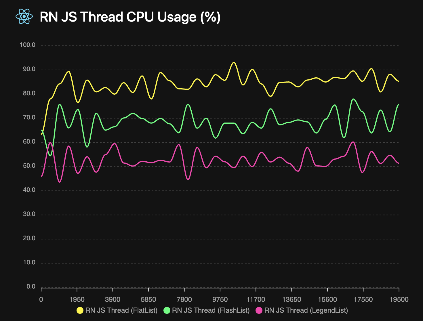 ## Built for Chat and Feeds